기본 엘리먼트는 위에서 아래로 배치되는 것이 기본이지만, 다양한 속성을 활용해서 다양하게 표현 가능하다.
Display
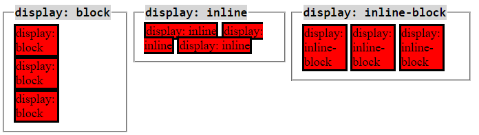
Inline elements
- respect left & right margins and padding, but not top & bottom
- cannot have a width and height set
- allow other elements to sit to their left and right
Block elements
- respect all of those
- force a line break after the block element
- acquires full-width if width not defined
Inline-block elements
- allow other elements to sit to their left and right
- respect top & bottom margins and padding
- respect height and width
Position
position 속성을 사용하면 상대적/절대적으로 특정 위치에 엘리먼트를 배치하는 것이 수월하다.
<!DOCTYPE html>
<html>
    <head>
        <meta charset="utf-8">
        <meta name="viewport" content="width=device-width">
        <title>JS Bin</title>
        </head>
    <body>

        <div class="wrap">
            <div class="static">static(default)</div>
            <div class="relative">relative(left:10px)</div>
            <div class="absolute">absolute(left:130px;top:30px)</div>
            <div class="fixed">fixed(top:250px)</div>
        </div>

    </body>
</html>
.wrap {
position:relative;
}
.wrap > div {
width:150px;
height:100px;
border:1px solid gray;
font-size:0.7em;
text-align:center;
line-height:100px;
}
.relative {
position:relative;
left:10px;
1top:10px;
}
.absolute {
position:absolute;
left:130px;
top:30px;
}
.fixed {
position:fixed;
top:250px;
}
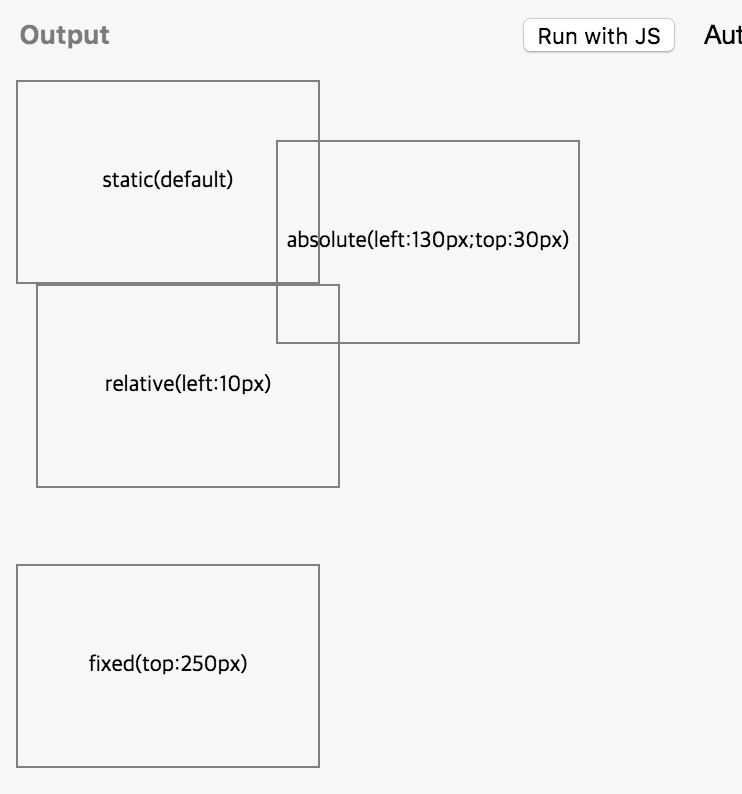
static
- 포지션 기본 성질
- 순서대로 배치
absolute
- top / left / right / bottom 으로 설정
- 기준점에 따라서 특별한 위치에 위치
- 기준점을 상위엘리먼트로 단계적으로 찾아가는데 static이 아닌 position이 기준점 (static이 아닌 상위 엘리먼트가 없으면 body를 기준으로)
- 특별한 위치에 배치하기 위해서는 position absolute를 사용하고, 기준점을 relative로 설정
relative
- 원래 자신이 위치해야 할 곳을 기준으로 이동
- top / left / right / bottom로 설정
fixed
- viewport(전체화면) 좌측, 맨 위를 기준으로 동작 (광고 같은 거)
Float
- float 속성으로 원래 flow에서 벗어날 수 있고 둥둥 떠다닐 수 있다. 따라서 뒤에block엘리먼트가 float 된 엘리먼트를 의식하지 못하고 중첩돼서 배치
- 전체 레이아웃 배치에서 유용하게 사용됨 ! (요즘은 )
Box-sizing
- padding 속성을 사용하면 엘리먼트 크기가 달라 질 수 있는데, Box-sizing을 사용하면 엘리먼트 크기를 고정 할 수 있다.
Resource
http://www.edwith.org/boostcourse-web/lecture/16677/ https://stackoverflow.com/questions/9189810/css-display-inline-vs-inline-block https://www.w3schools.com/cssref/pr_class_display.asp